Federal Harms Tracker
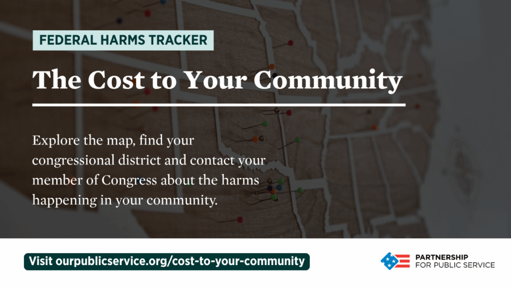
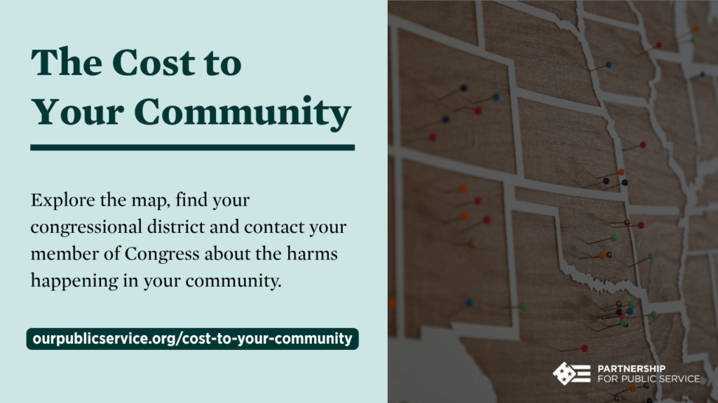
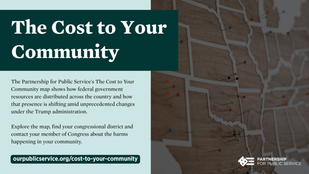
The Cost to Your Community
COMMUNICATIONS Toolkit
About the Partnership for Public Service

The Partnership for Public Service is a nonpartisan, nonprofit organization that strives for a more effective government for the American people. We work across administrations and political parties to help federal agencies better deliver on their missions through improved leadership, workforce management, and organizational effectiveness. Learn more at ourpublicservice.org.
About the Cost to Your Community
The Partnership for Public Service’s newest interactive map, The Cost to Your Community, is designed to show the federal government’s footprint across states, cities and communities nationwide, combining state- and congressional district-level data on federal personnel, funding and infrastructure to show how government resources are distributed around the country and how that presence is shifting amid unprecedented changes under the Trump administration.
Marketing
Sample newsletter blurb
The Partnership for Public Service’s new interactive map, The Cost to Your Community, shows how federal workforce reductions, funding cuts and institutional changes are affecting communities nationwide. The map combines state and congressional-district level data and impact stories to show how government resources are distributed around the country and how that presence is shifting under the Trump administration.
Learn how federal cuts are having a direct, tangible impact on Americans in [State] and contact your member of Congress about the harms happening in your community.
Social Media Posts
Click the ☰ icon right below this sentence or the > icon next to the posts to find the right social post for you.
Email message template
Subject line options:
- New federal stories map: The Cost to Your Community
- New tool for understanding the federal stories in your community
- New resource: The Cost to Your Community map
Body message:
Hi [First Name],
I wanted to share a valuable resource that just launched: The Cost to Your Community, a new interactive map from the Partnership for Public Service.
This is the third product in their Federal Harms Tracker series, and it is designed to show the federal government’s footprint and impact across states and communities nationwide. The map combines state- and congressional district-level data on federal personnel, funding and infrastructure to show how government resources are distributed around the country—and how that presence is shifting amid the changes happening under the Trump administration.
What makes The Cost to Your Community particularly useful:
It’s not just about numbers—every congressional district is paired with a story of harm or risk at the local level, and the map includes in-depth spotlight stories that highlight the direct effect on individuals and organizations in our communities. It shows the erosion of federal institutions and reveals how these often haphazard cuts are negatively affecting the American people in real and everyday ways.
I invite you to join me in sharing the impact and harms happening in [State] due to federal cuts. The Partnership is also collecting stories from communities, so if you know of impacts worth documenting, there’s a form here to share those stories. I hope you find The Cost to Your Community as useful as I have.
Thank you,
[Name of sender]DOwnloads
Right click any of the image below and select “save image as.”